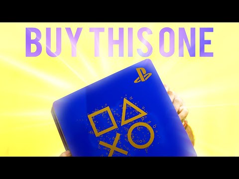
(Upbeat music) – Sony's Days of Play Sale has just started, and by far one of the coolest things about this, is their Limited Edition PS4 Slim (upbeat music) I gotta say when I first saw pictures of this thing my immediate thought was, that looks really good
This is the best looking PS4 Slim, and possibly even just the best lookin' PS4 they've released so far And seeing it in person, just further confirms it (upbeat music) Last time was just was solid color, whereas this time we're doing this blue design which looks really nice But on top of it your getting this gold symbols on the top, which look beautiful (upbeat music) Even when I'm kinda noticing certain things about it that I'm normally not a huge fan of, like for instance I've told you guys a bunch of times before, I don't like how Sony's obsessed with doing gloss tops on their Special Editions
And while that normally is true, it works really well here You know, especially because they're using a mixture of a matte color and a metalic, where we have the gold Just altogether on the gloss looks really nice If I want to be nitpicky, there are some little things about it that do bother me Mostly having to do with the controller and a part of the system you're never going to see
For the controller the blue looks really nice, personally, I'm not just a huge fan of when on the controller touch pad they do this sort of patterning design where they just put the symbols over and over again Personally, I'm just not a big fan of that I would have much rather just seen, in bigger letters each symbol once across the middle I think that would have looked better, but ya know personal preference As for the system, this is super nitpicky and minor
But if we're gonna talk about negatives it's on the back side and right here So, the feet design they always have the couple of rubber ones mixed in And normally while they are a different color than the other feet it's not that noticeable because it's pretty dull tones But with how vibrant the blue is you really notice the grey on the circular and X feet right here Super nitpicky thing, I know but yeah
So other than just those two things, honestly this is an incredible looking system By the way guys, I'm gonna be taking a lot of still shots of this thing and put on my Instagram So if you guys wanna see more of it make sure to check that out
Now some of you may be looking at this system and the design on top with the square, triangle, X, and circle, and wondering why are those things that PlayStation uses? Well, it's actually really interesting It was talked about back in 2010 in an interview, with the guy that designed the original PS controller, Teiyu Goto, I hope I pronounced that right And it's really interesting how this came to be So, at the time when the PS1 was being designed, the biggest competitors, were Nintendo, and Sega And for them their controllers all used the same kinda basic design, instead of using just letters like A, B, X, Y, and so-on-and-so-forth
And some of them using colorful buttons as well They wanted to do something different to help differentiate their controller So the idea was to use symbols instead that represented different things that might be used in game It's not always that actual direct comparison, but that's the idea So for the triangle the idea is that it associates with point of view, the character head, what direction the camera is looking at that kind of idea
With the square it's supposed to be a piece of paper or a menu, something that brings up an option select for, end game menu, something from traditional options The X and O are by far the simplest ones, which are simply yes and no X being no, cancel whatever, circle being yes, accept, so-on-and-so-forth, which is really funny, because it gets confusing with American ports of games Cause, X is always one for select, so it gets really confusing sometimes And a really fun fact, about this too, by the way, is that the designer also picked what colors he wanted each one to be
And apparently, had an arguments with other co-workers over the fact that he wanted the X which is decline to be blue and the circle which is accept to be red Cause, everyone was like, doesn't that make more sense the other way around And he's like no, this is what we're doing, this is what I want So that's how those symbols came to be and honestly I think they've been incorporated, beautifully into this system's design I know, I said earlier, when I first saw this thing, my thought was like, oh wow this is one of the best PS4s they've done
And yeah, I definitely still think that, I mean, they have some other ones that your mileage may vary Where, you may like a certain one color more, but as far as incorporating, a great color choice, with a cool design Definitely, best looking Slim and probably the best looking of all the PS4 designs even compared to Pros
I think maybe the God of War one gives it some competition But, yeah this is definitely the best looking one in my opinion, these are showing up in stores right now It's really hard to do any kind of online order ones, cause those went up earlier, but you might have your luck in a store We'll put a link down below just for you guys to check out, and I'll see you guys later